
CLASSES ↑ beginner to advanced ↓
CONVERSION RATE ACADEMY
Identifying What to Test First: Effort vs. Impact
Once you can generate ideas, the bottleneck becomes choosing the right ones. This class gives you a simple prioritization system so you stop running “interesting” tests and start running tests that reliably produce ROI.
Where are customers struggling the most? What happens if we fix it?
Start With Diagnosis, Not Ideas
- Heatmaps reveal ignored content, missed CTAs, and false affordances.
- Session replays expose hesitation, confusion, rage clicks, and abandonment.
- Analytics show where high-intent traffic drops off.
- Live chat logs & AI CRO chat surface repeated objections and misunderstandings.
Only once you understand why users aren’t converting should you decide what to test.
Prioritization the Winner’s Way
Once you have real problems identified, prioritization becomes straightforward.
Winning teams rank tests based on four questions:
Impact
If this test wins, does it materially affect revenue, leads, or downstream conversion-not just clicks?
Reach
How much high-intent traffic flows through this problem area?
Confidence
Is the hypothesis grounded in observed user behavior, not opinion?
Effort
How quickly can we ship a clean test without introducing complexity or risk?
Low-effort / high-impact ideas rise naturally to the top.
High-effort / low-impact ideas are parked or deleted.
Use the Effort vs. Impact grid:
- High Impact / Low Effort: do these first (copy tweaks, CTA placement, trust blocks, FAQs).
- High Impact / High Effort: plan these (checkout redesign, pricing restructure, page rebuild).
- Low Impact / Low Effort: only when you need quick wins or learning.
- Low Impact / High Effort: avoid.
Backlog rule: Always keep a “Next Test” list, and only pull from that list. If a new idea appears, it must be scored before it can enter the top 10.
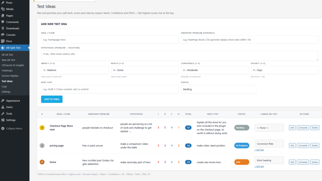

| # | Page / Flow | Observed Problem (evidence) | Hypothesis (Problem → Solution) | Impact (1–5) |
Reach (1–5) |
Confidence (1–5) |
Effort* (1–5) |
Total | Next Step |
|---|---|---|---|---|---|---|---|---|---|
| 1 | Homepage Hero | Heatmap shows CTA ignored; replays show scrolling + exits within 10–15s. | If we make the primary benefit unmistakable and pair it with a clearer CTA, more visitors will enter the funnel. | 5 | 5 | 3 | 5 | 18 | Draft 2–3 hero variants (value prop + CTA). Test vs control. |
| 2 | Pricing Page | Users hover on pricing, bounce; chat logs ask “what’s included?” repeatedly. | If we anchor value and answer top objections above the fold, more visitors will start checkout. | 5 | 4 | 4 | 4 | 17 | Add “what you get” summary + proof + objection FAQ. Test layout. |
| 3 | Checkout | Rage clicks on Continue; replays show repeated form edits; drop-off spikes at payment step. | If we clarify validation errors and reduce uncertainty at payment, more users will complete purchase. | 4 | 5 | 5 | 3 | 17 | Improve error messaging + inline hints. A/B test to completion rate. |
| 4 | Lead Form | Drop-off on phone field; users hesitate; exit survey mentions “don’t want calls”. | If we reduce perceived risk (explain usage / make field optional), more users will submit. | 3 | 4 | 4 | 5 | 16 | Make phone optional + add “no spam” note. Test submit rate. |
| *Effort is reversed: 5 = very easy / fast to ship, 1 = very hard / slow / risky. Sort by Total to pick what to test first. | |||||||||