How to A/B Test Your WordPress Navigation (And Why You Should)
Does your menu have 15 links? Three levels of dropdowns? Users getting lost?
Most sites never test their menu. They add links as they grow. Eventually it's bloated, confusing, and hurting conversions.
Here's how to fix it.
Why navigation matters
Your menu is on every page. It's the primary navigation tool. If it doesn't work, nothing else matters.
Common problems:
× Too many options (choice paralysis)
× Poor hierarchy (important stuff buried)
× Vague labels ("Solutions" vs "What We Do")
× Missing CTAs (no clear next step)
× Mobile disasters (15 items in a hamburger menu)
How to know if your menu is the problem
Look at the data:
Heatmaps show where people actually click. If your menu gets ignored, simplify it.
Session replays show the full journey. Watch people hover over menu items, get confused, and leave.
Click tracking shows which links work and which don't. Kill the dead weight.
AB Split Test tracks all of this locally in WordPress. No external scripts. No privacy issues.
What to test
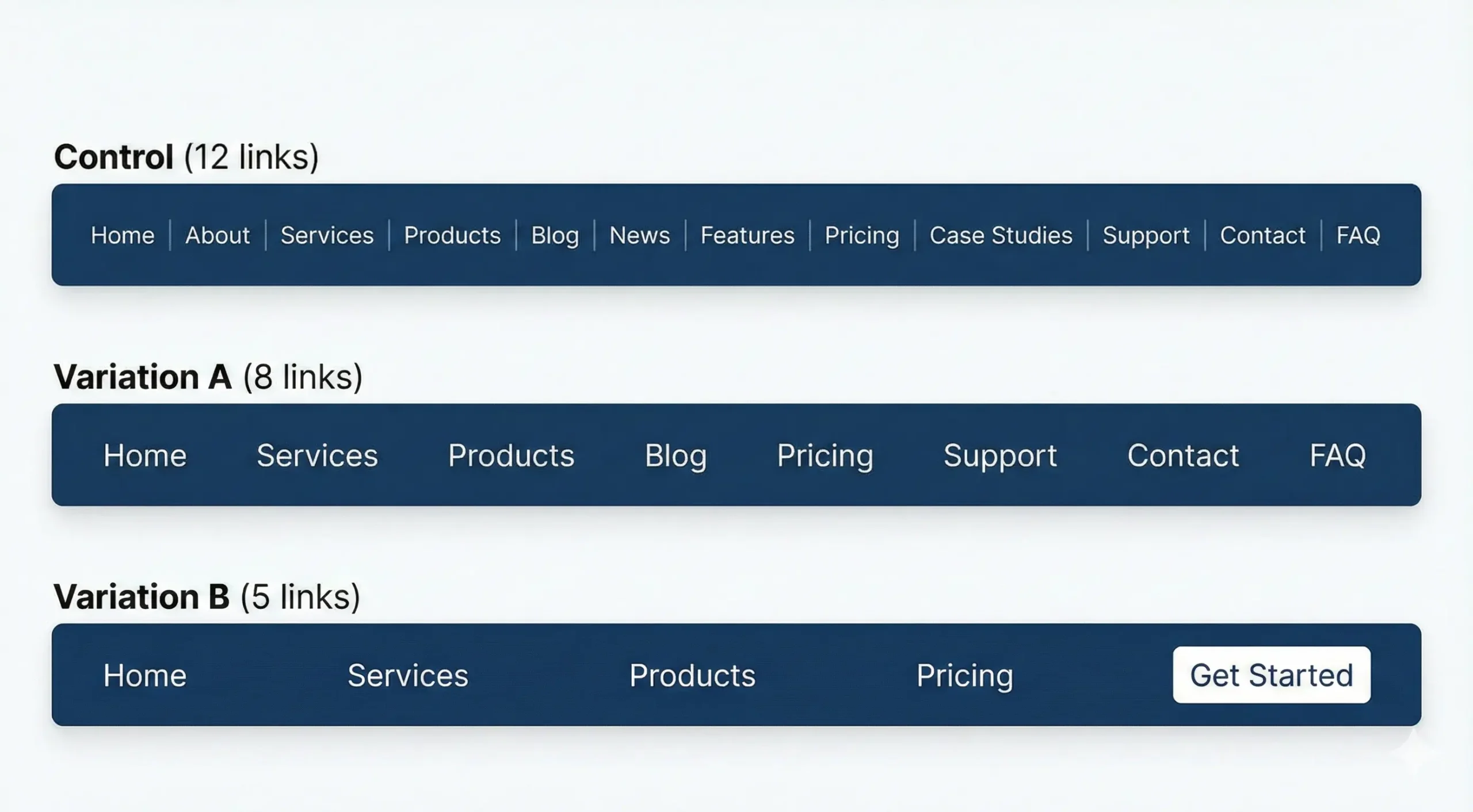
Number of items - Watch conversion rate. Fewer is often better.
Most sites have too many menu links.
Control: 12 links
Variation A: 8 links (remove lowest performers)
Variation B: 5 links (only essentials)
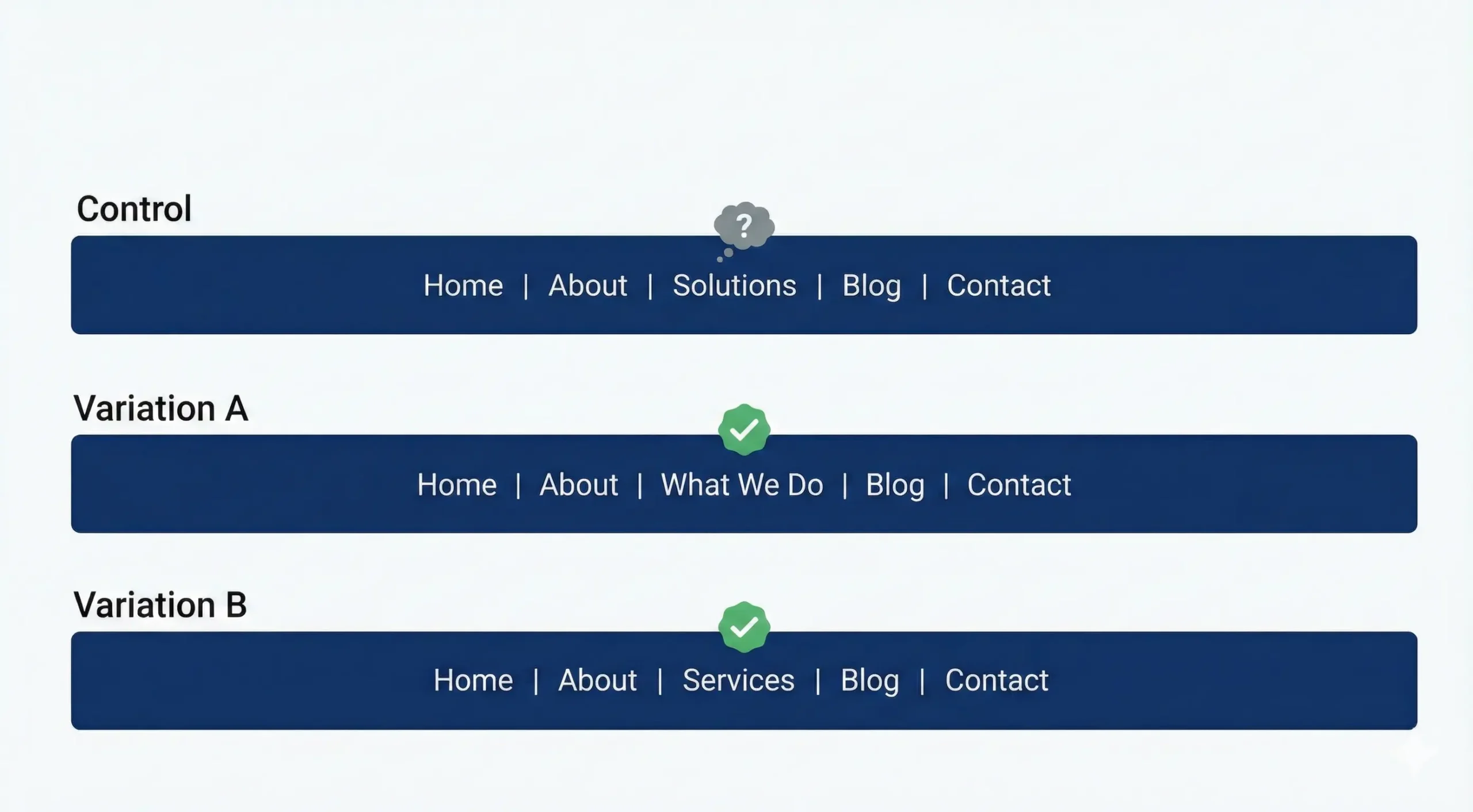
Label clarity - Test which drives more clicks and conversions.
Vague labels confuse users.
Control: "Solutions"
Variation A: "What We Do"
Variation B: "Services"
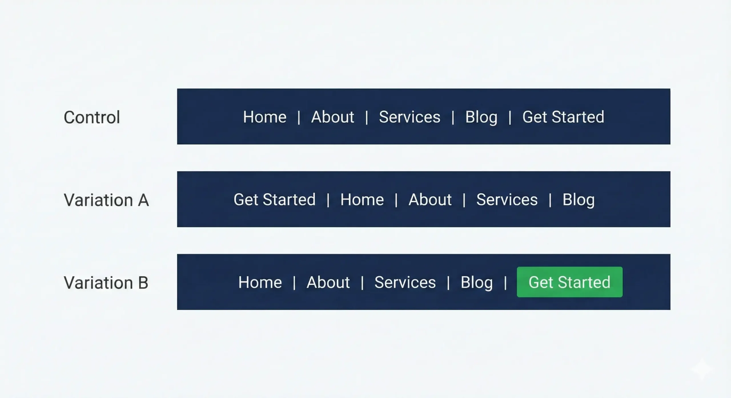
CTA placement - Visibility matters.
Where's your primary call-to-action?
Control: Last item in menu
Variation A: First item in menu
Variation B: Button style (different color/size)
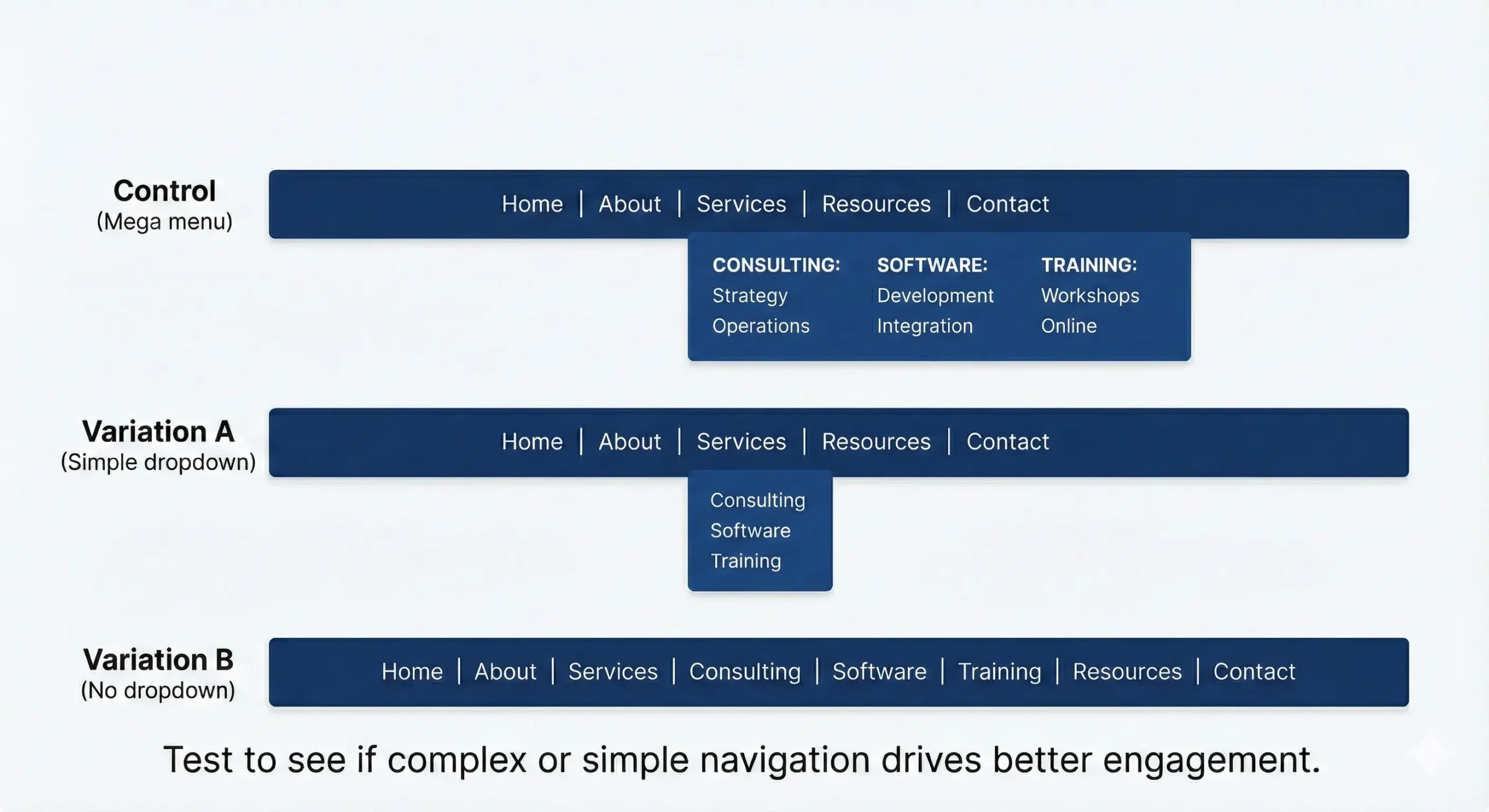
Mega menu vs Simple - Test what works for your audience.
Complex dropdowns can help or hurt.
Control: Mega menu with categories
Variation A: Simple dropdown
Variation B: No dropdown (flat menu)
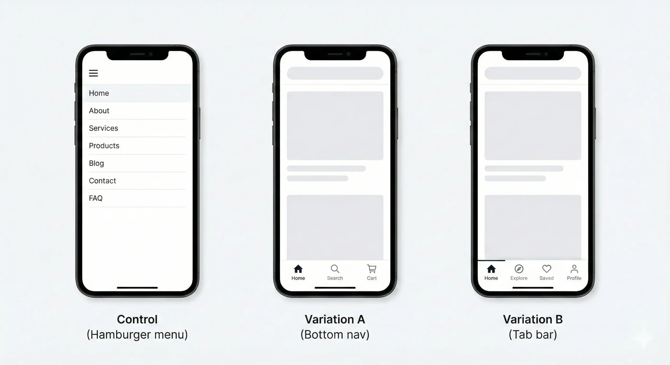
Mobile optimization - Mobile users behave differently. Test accordingly.
Your mobile menu is probably different from your desktop.
Control: Hamburger with full menu
Variation A: Bottom nav with key items
Variation B: Tab bar (app-style)
Common findings
From tests we've seen:
- Simpler menus usually win (6-8 items beats 12-15)
- CTAs in the menu increase conversions 15-40%
- Clear labels beat clever ones
- Mobile needs different navigation than desktop
- Mega menus work for eCommerce, fail for services
Your mileage will vary. That's why you test.
AB Split Test runs entirely inside WordPress. No external dashboards. No redirects. No privacy issues. Your menu is on every page. Test it.