Are Visitors Even Seeing Your Footer? (Here’s How to Know)
Your footer is on every page of your site.
But is anyone looking at it?
Most footers are cluttered. Links to every page, social icons, newsletter signup, legal stuff, contact info, awards, certifications, partnerships...
It becomes noise.
Here's how to know if your footer matters and what to do about it.
The Problem with Most Footers
Footers become dumping grounds.
Every time someone asks "Where should we put this link?" the answer is "Put it in the footer."
Eventually you've got 40 links competing for attention.
Two common mistakes:
- Too much clutter Legal links get the same visual weight as your primary CTA. Everything competes. Nothing wins.
- No clear purpose Is your footer for navigation? Lead capture? Trust signals? If you don't know, your visitors definitely don't.

They sell mattresses and pillows, yet it looks like we're on a banks website.
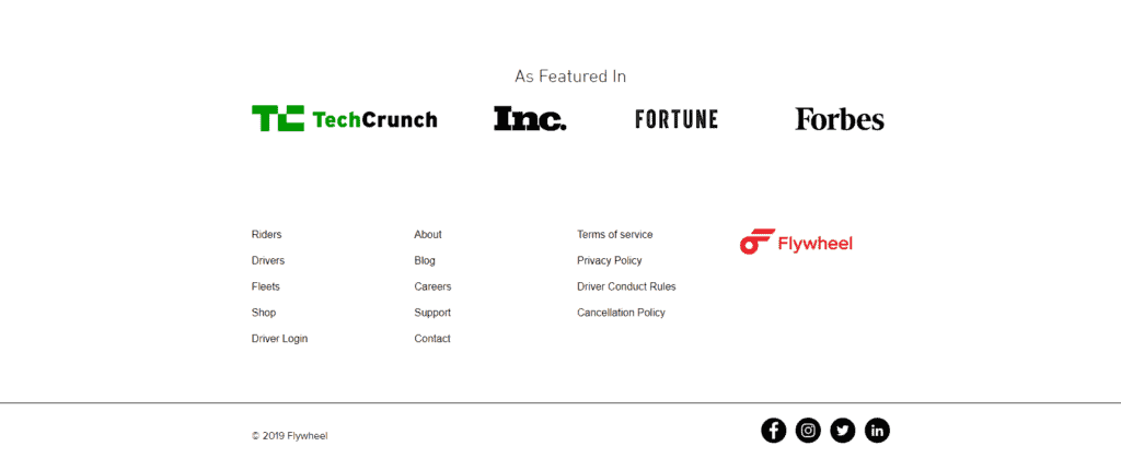
The pages that would rarely get clicked on are getting as much weight as the more popular options.
How to See If Your Footer Works
Stop guessing. Look at the data.
1. Heatmaps show where people click
Run a click heatmap on your key pages.
If your footer is getting zero clicks, it's wasted space.
If only the legal links get clicks (privacy policy, terms), you're just meeting requirements and not driving action.
AB Split Test's heatmap run locally in WordPress. No external scripts. No privacy issues. Just data on what's actually getting clicked.
2. Scroll maps show who sees it
Most visitors don't scroll to the footer.
Scroll maps show exactly how far down the page people go. If 70% of visitors never reach your footer, optimizing it won't matter.
Focus on what they actually see instead.
3. Session replays show the full journey
Watch real users interact with your site.
Session replays show:
• Do they scroll to the footer?
• Do they hover over links?
• Do they click and bounce?
• Where do they get confused?
This tells you if your footer helps or hurts the user journey.
4. Scroll depth conversion tracks engagement
Set a conversion goal when users scroll to your footer (e.g., 85% scroll depth). This shows:
• How many visitors actually reach your footer
• Which pages have better footer visibility
• If footer engagement correlates with conversions
If only 15% of visitors see your footer, but 80% of converters do, that tells you something important about your funnel.
What to Test
Once you know your footer matters (or could), test variations.
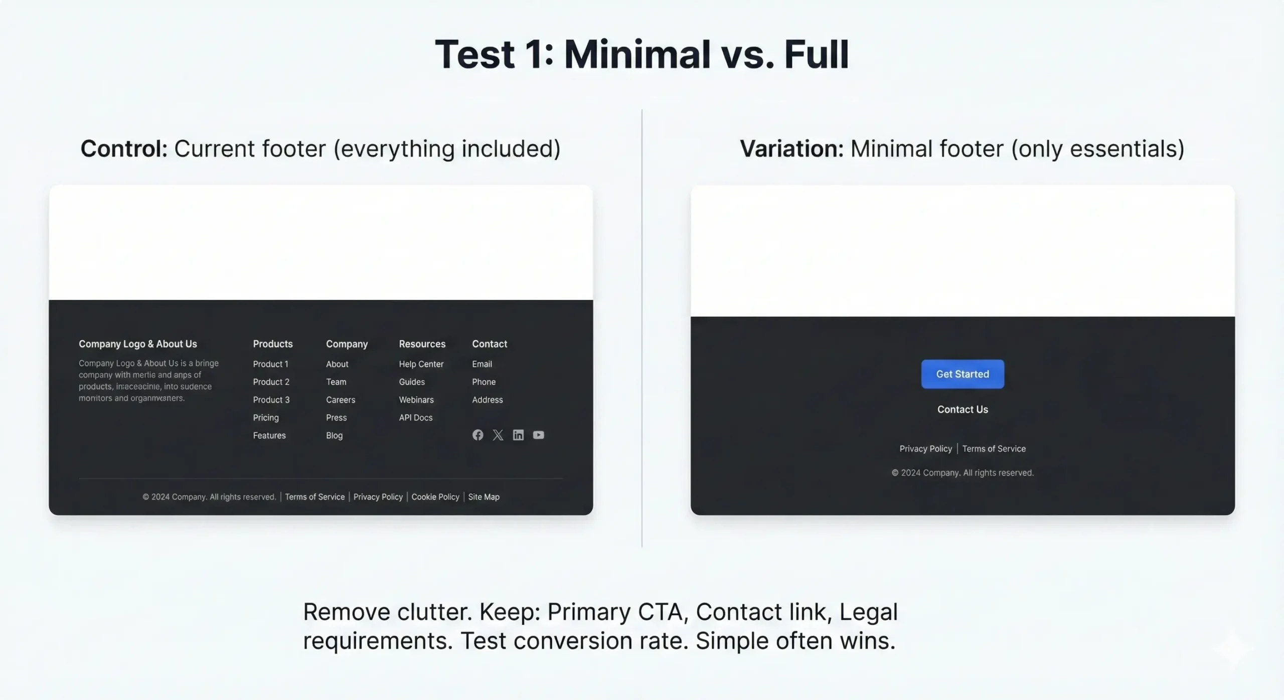
Test 1: Minimal vs. Full
Control: Current footer (everything included)
Variation: Minimal footer (only essentials)
Remove clutter. Keep:
- Primary CTA
- Contact link
- Legal requirements
Test conversion rate. Simple often wins.
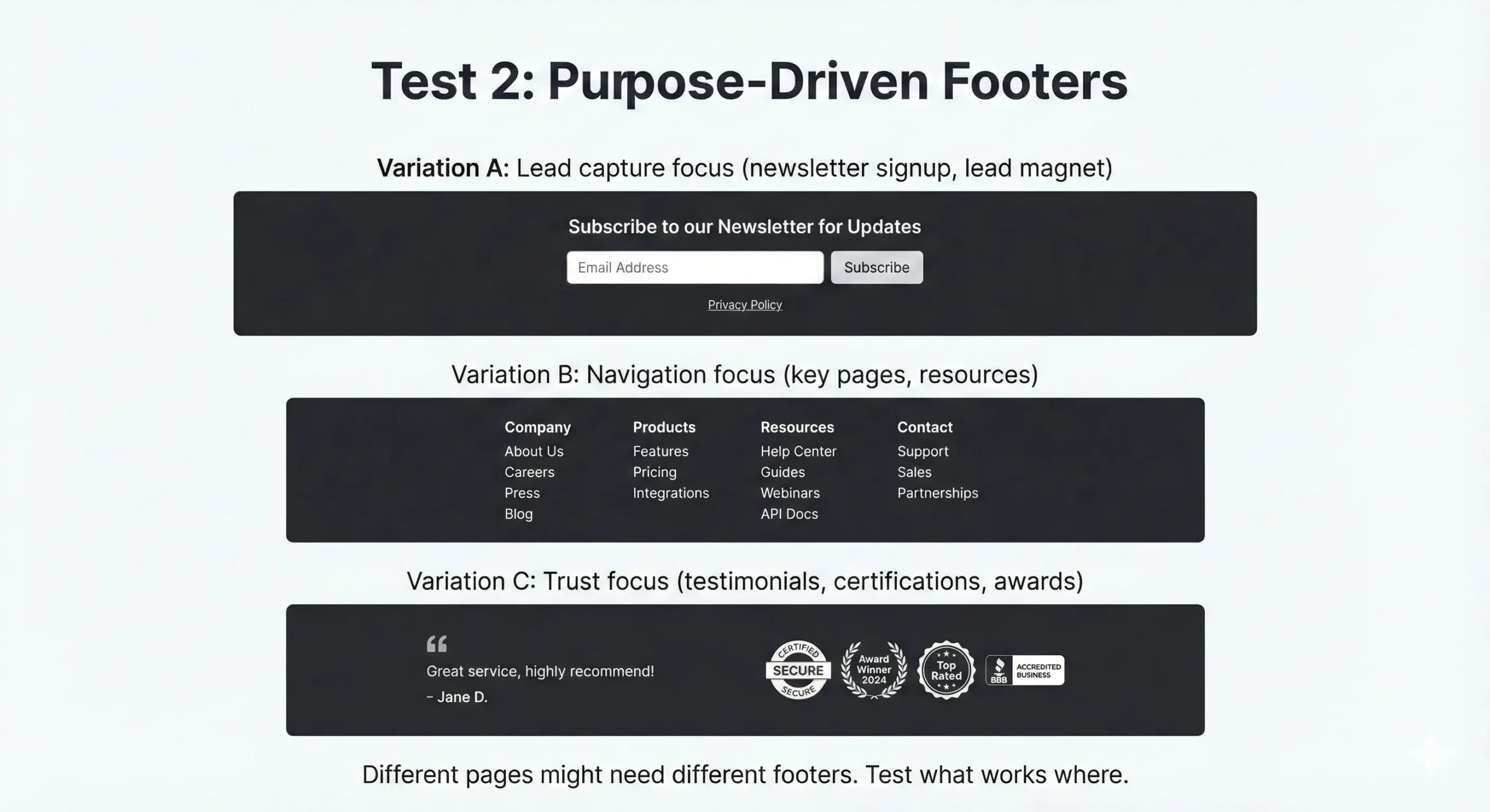
Test 2: Purpose-Driven Footers
Variation A: Lead capture focus (newsletter signup, lead magnet)
Variation B: Navigation focus (key pages, resources)
Variation C: Trust focus (testimonials, certifications, awards)
Different pages might need different footers. Test what works where.
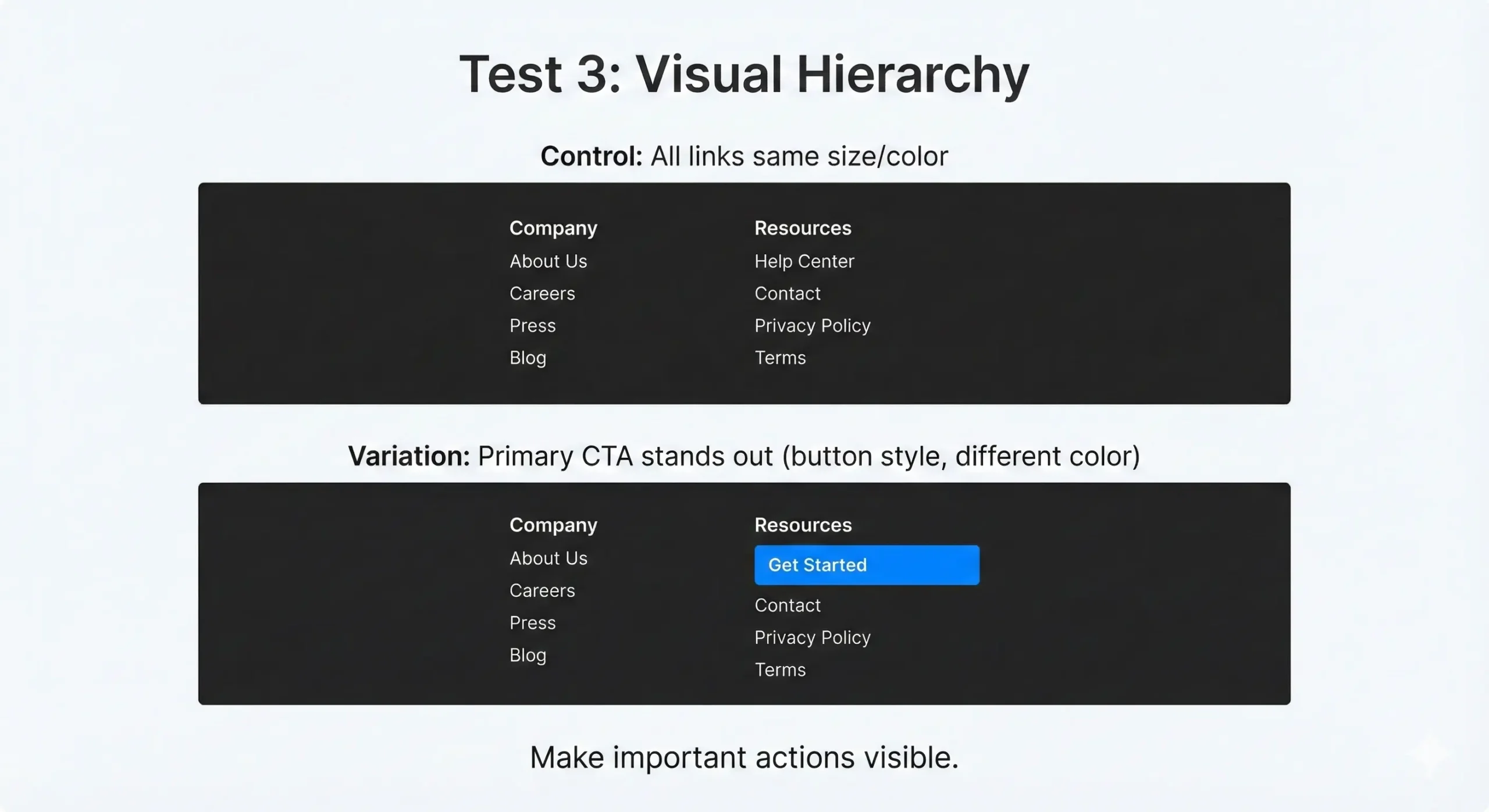
Test 3: Visual Hierarchy
Control: All links same size/color
Variation: Primary CTA stands out (button style, different color)
Make important actions visible.
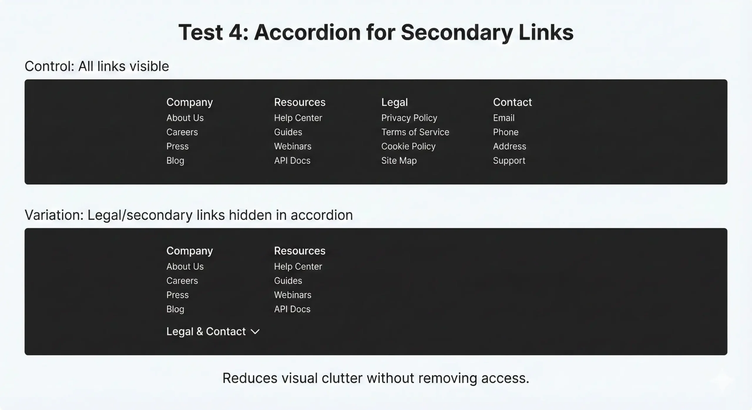
Test 4: Accordion for Secondary Links
Control: All links visible
Variation: Legal/secondary links hidden in accordion
Reduces visual clutter without removing access.
What We've Seen
From tests we've tracked:
Minimal footers usually perform better on service sites. Less distraction = more focus on primary conversion.
Lead capture footers work well on content sites. If someone scrolled to the bottom, they engaged with your content then it's good time to ask for email.
Trust signals matter on eCommerce sites. Reviews, security badges, return policy visibility in footer increase checkout completion.
Mobile needs different treatment. Desktop footer with 50 links doesn't work on mobile. Test mobile-specific versions.
Your footer is on every page. Turn it into revenue.