3 Call-to-Action Tests That Actually Improve Conversions
Your call-to-action matters.
It's the difference between a visitor converting or leaving.
But most sites guess at their CTAs. Pick a color. Write some copy. Hope it works.
Here's a better approach: test what actually converts.
These three CTA tests consistently show results.
Test 1: Button Copy (What You Say)
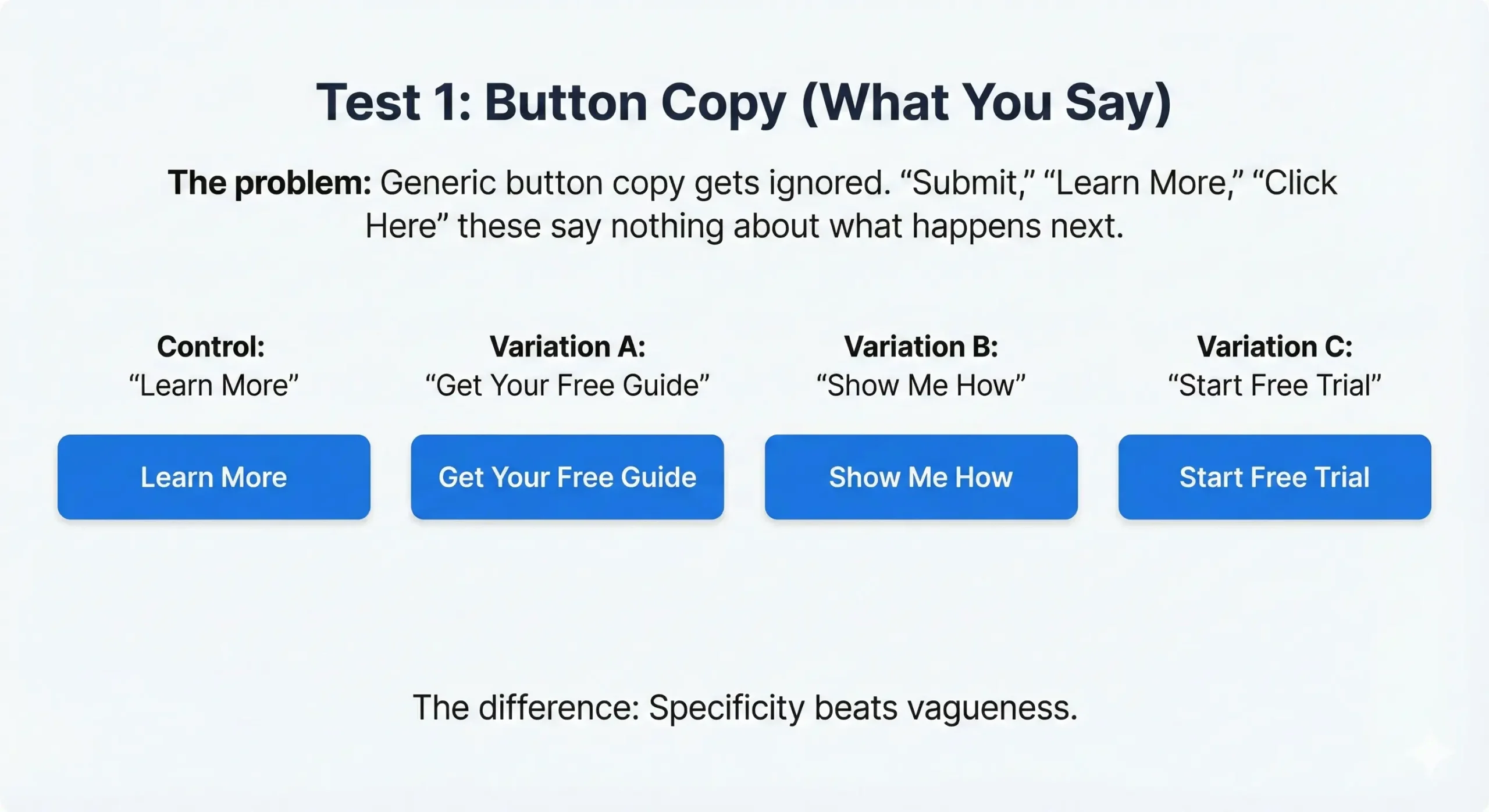
The problem: Generic button copy gets ignored.
"Submit," "Learn More," "Click Here" these say nothing about what happens next.
What to test:
Control: "Learn More"
Variation A: "Get Your Free Guide"
Variation B: "Show Me How"
Variation C: "Start Free Trial"
The difference: Specificity beats vagueness.

Common findings:
- Action-oriented copy ("Get," "Start," "Download") converts better than passive ("Learn," "View")
- Benefit-focused copy ("Get 30% More Leads") beats feature-focused ("See Our Features")
- First-person copy ("Show Me," "Send My Report") can outperform second-person by 20-40%
How to test it:
With Magic Mode: Click the button, select "edit text," CROAssist AI suggests variations based on your page context. Pick one, launch test.
It takes 60 seconds.
Test 2: Button Placement (Where It Lives)
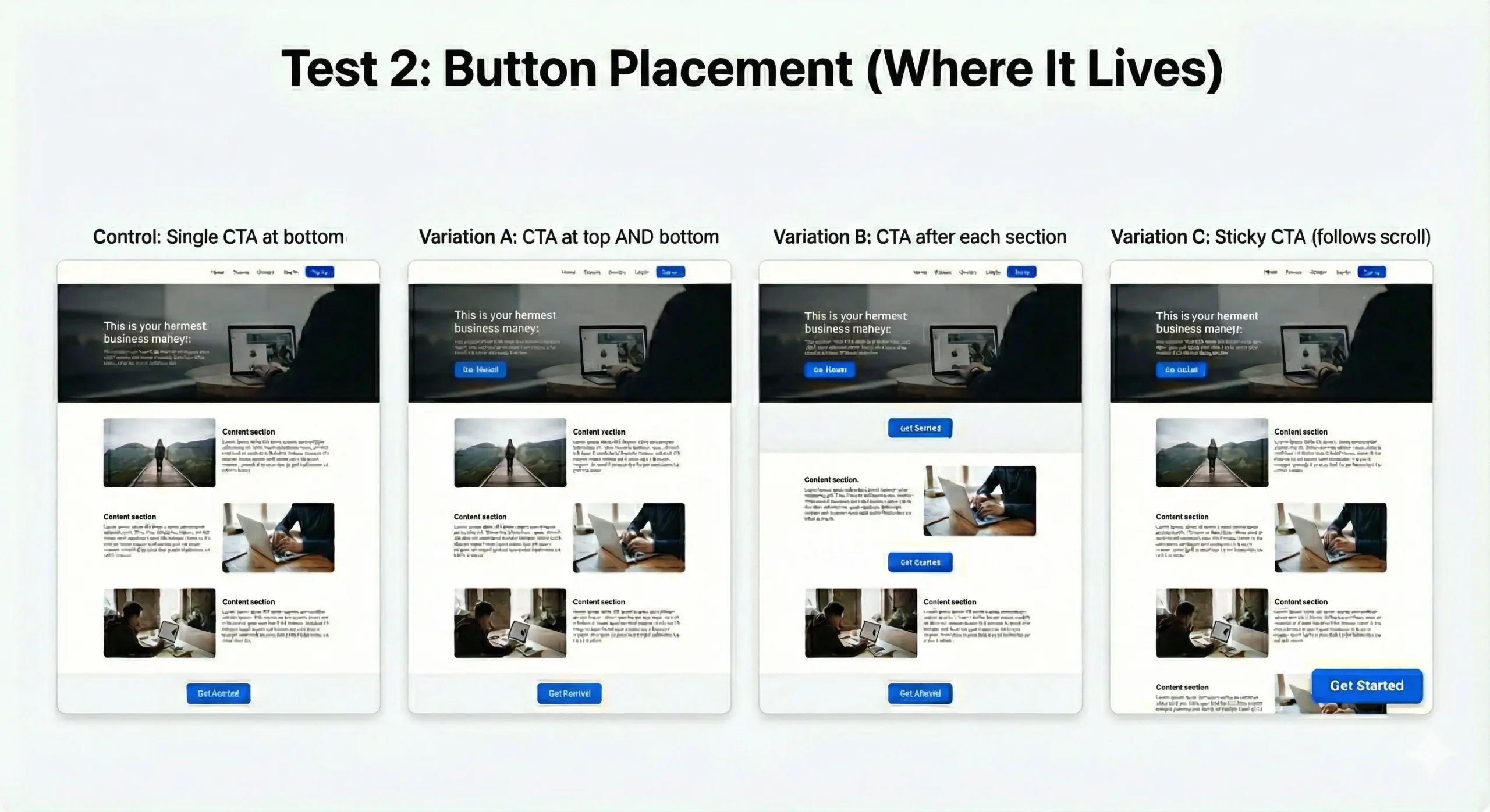
The problem: Your CTA might be in the wrong spot.
Most sites put CTAs at the bottom. Users scroll, then decide. But what if they're ready earlier?
What to test:
Control: Single CTA at bottom
Variation A: CTA at top AND bottom
Variation B: CTA after each section
Variation C: Sticky CTA (follows scroll)
The difference: Meeting users where they are.

Common findings:
- Long-form content benefits from multiple CTAs (users convert when ready, not when you tell them)
- Short pages convert better with single, prominent CTA
- Mobile users need earlier CTAs (less scrolling tolerance)
- Sticky CTAs increase conversions 15-30% on high-intent pages
How to validate it:
Scroll maps show how far users actually scroll. If 60% don't reach your CTA, move it up.
Heatmaps show where users click. If they're clicking non-clickable elements near where a CTA should be, that's your spot.
Session replays show the actual journey. Watch where users pause, re-read, or seem ready to act.
Then test placement variations.
Test 3: CTA Design (How It Looks)
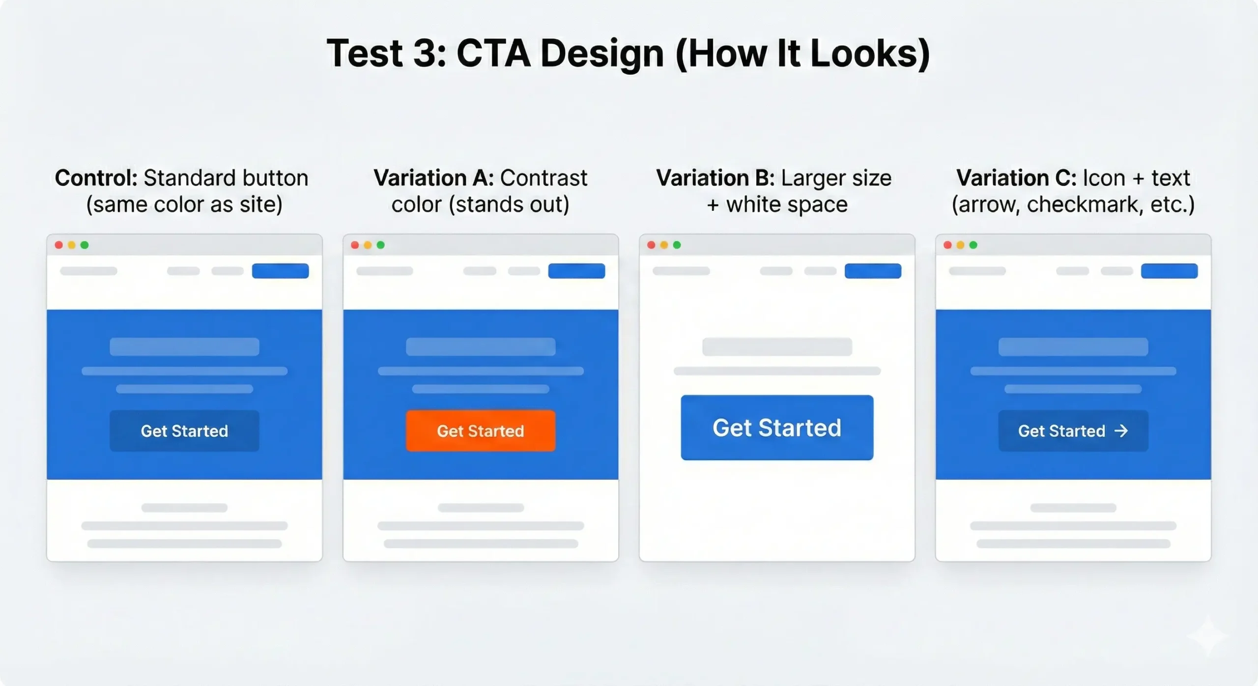
The problem: Your button doesn't stand out.
If your CTA blends into the page, it's invisible.
What to test:
Control: Standard button (same color as site)
Variation A: Contrast color (stands out)
Variation B: Larger size + white space
Variation C: Icon + text (arrow, checkmark, etc.)
The difference: Visual hierarchy matters.

Common findings:
- Contrast beats brand consistency (your CTA should be the most visible element on the page)
- Size matters, but too big feels pushy (test the threshold)
- Icons increase clicks 10-20% IF they're relevant (arrow = forward action, checkmark = completion)
- White space around CTAs increases conversion 25-35%
Color testing reality: Red doesn't always beat green. Test what stands out on YOUR page with YOUR audience.
How to test it:
Create variations in your page builder. Test them.
Heatmaps show if the button is getting clicks. If it's not, visibility is the problem.
Quick Wins: What to Test First
Start with the highest-impact change:
If your CTA gets clicks but doesn't convert: Test copy (what you promise)
If your CTA doesn't get clicks: Test design (visibility, contrast)
If users are bouncing before reaching your CTA: Test placement (move it up, add earlier options)
How to Set It Up
Using Magic Mode:
- Click your CTA button
- Choose what to test (text, design, placement)
- CROAssist AI suggests variations
- Launch test
Done in under 2 minutes.
Works with all page builders: Blocks, Elementor, Beaver Builder, Bricks, Breakdance, Oxygen, WPBakery, and more.
Pick one test. Run it.
Your call-to-action decides if visitors convert or leave. Test it.